

Overview
Overview
Overview
Style Avenue is a clothing store that offers affordable pricing options. The typical user is between 19-30 years old, and most users are college students or early career professionals. Style Avenue goal is to make shopping fun, fast, and easy for all types of users.
Style Avenue is a clothing store that offers affordable pricing options. The typical user is between 19-30 years old, and most users are college students or early career professionals. Style Avenue goal is to make shopping fun, fast, and easy for all types of users.
Problem
Available online shopping websites have cluttered designs, inefficient systems for browsing through products, and confusing checkout processes.
During movie break there is less time and big crowd at snack counters. Some time its hard to tackale growd when you are at movie with your kid.
Solution
Design a Style Avenue website to be user friendly by providing clear navigation and offering a fast checkout process.
My Role
UX designer leading the Style Avenue website design
Design Process
Design Process
Design Process
I Followed the user centred Design methodology that leads to concentrate design solutions from ideas
inspired by research observing of users.
I Followed the user centred Design methodology that leads to concentrate design solutions from ideas
inspired by research observing of users.
I Followed the user centred Design methodology that leads to concentrate design solutions from ideas
inspired by research observing of users.


UX Research
UX Research
UX Research
Summary
Summary
Summary
I conducted user interviews, which I then turned into empathy maps to better understand the target user and their needs. I discovered that many target users treat online shopping as a fun and relaxing activity when they need a break from school or work. However, many shopping websites are overwhelming and confusing to navigate, which frustrated many target users. This caused a normally enjoyable experience to become challenging for them, defeating the purpose of relaxation.
I conducted user interviews, which I then turned into empathy maps to better understand the target user and their needs. I discovered that many target users treat online shopping as a fun and relaxing activity when they need a break from school or work. However, many shopping websites are overwhelming and confusing to navigate, which frustrated many target users. This caused a normally enjoyable experience to become challenging for them, defeating the purpose of relaxation.
Pain Points
Pain Points
Navigation
Shopping website designs are often busy, which results in confusing navigation
Shopping website designs are often busy, which results in confusing navigation
Interaction
Interaction
Small buttons on shopping websites make item selection difficult, which sometimes leads users to make mistakes
Small buttons on shopping websites make item selection difficult, which sometimes leads users to make mistakes
Experience
Experience
Online shopping websites don’t provide an engaging browsing experience
Online shopping websites don’t provide an engaging browsing experience
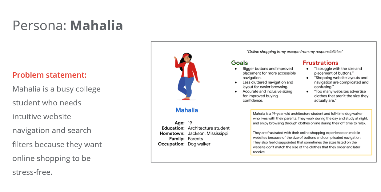
Personas
User journey map
User journey map
User journey map
I created a user journey map of Mahalia’s experience using the site to help identify possible pain points and improvement opportunities.
Mapping ruchitas journey shows how easy it will be for user to have access to a dedicated in-movie snack ordering application.
Mapping ruchitas journey shows how easy it will be for user to have access to a dedicated in-movie snack ordering application.

Site Maps
Site Maps
Site Maps
Difficulty with website navigation was a primary pain point for users, so I used that knowledge to create a sitemap.
My goal here was to make strategic information architecture decisions that would improve overall website navigation. The structure I chose was designed to make things simple and easy.

Paper wireframes
Paper wireframes
Paper wireframes
Next, I sketched out paper wireframes for each screen in my app, keeping the user pain points about navigation, browsing, and checkout flow in mind.
The home screen paper wireframe variations to the right focus on optimizing the browsing experience for users.
Next, I sketched out paper wireframes for each screen in my app, keeping the user pain points about navigation, browsing, and checkout flow in mind.
The home screen paper wireframe variations to the right focus on optimizing the browsing experience for users.

Digital wireframes
Digital wireframes
Digital wireframes
Moving from paper to digital wireframes made it easy to understand how the redesign could help address user pain points and improve the user experience.
Prioritizing useful button locations and visual element placement on the home page was a key part of my strategy.
Moving from paper to digital wireframes made it easy to understand how the redesign could help address user pain points and improve the user experience.
Prioritizing useful button locations and visual element placement on the home page was a key part of my strategy.
Moving from paper to digital wireframes made it easy to understand how the redesign could help address user pain points and improve the user experience.
Prioritizing useful button locations and visual element placement on the home page was a key part of my strategy.

Low-Fi wireframe
Low-Fi wireframe
To create a low-fidelity prototype, I connected all of the screens involved in the primary user flow of adding an item to the cart and checking out.
At this point, I had received feedback on my designs from members of my team about things like placement of buttons and page organization. I made sure to listen to their feedback, and I implemented several suggestions in places that addressed user pain points.

Mockups
Mockups
Mockups
Based on the insights from the usability study, I made changes to improve the site’s checkout flow. One of the changes I made was adding the option to edit the quantity of items in a user’s cart using a simple “+” or “-” option. This allowed users more freedom to edit their cart without going through a complicated process to add or remove items.
Based on the insights from the usability study, I made changes to improve the site’s checkout flow. One of the changes I made was adding the option to edit the quantity of items in a user’s cart using a simple “+” or “-” option. This allowed users more freedom to edit their cart without going through a complicated process to add or remove items.


High-Fi wireframe
High-Fi wireframe
My hi-fi prototype followed the same user flow as the lo-fi prototype, and included the design changes made after the usability study, as well as several changes suggested by members of my team.
My hi-fi prototype followed the same user flow as the lo-fi prototype, and included the design changes made after the usability study, as well as several changes suggested by members of my team.
My hi-fi prototype followed the same user flow as the lo-fi prototype, and included the design changes made after the usability study, as well as several changes suggested by members of my team.

Impact
Impact
Our target users shared that the design was intuitive to navigate through, more engaging with the images, and demonstrated a clear visual hierarchy.
What I learned
What I learned
I learned that even a small design change can have a huge impact on the user experience. The most important takeaway for me is to always focus on the real needs of the user when coming up with design ideas and solutions.
Next Steps
Next Steps
Conduct follow-up usability testing on the new website
Identify any additional areas of need and ideate on new features
Thank You
Other Projects


© Dipanshu. 2023